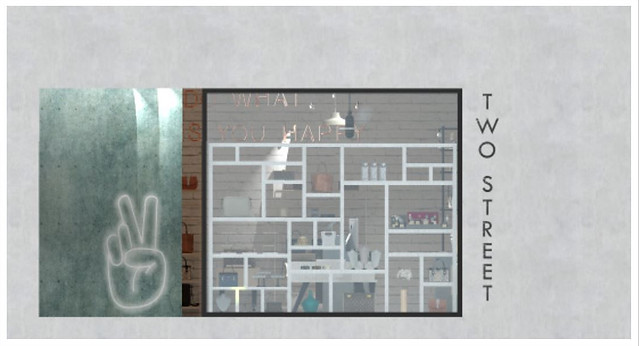
TWO STREET
The concept behind this brand is a minimalistic, gender neutral accessories line, emphasizing self love and inclusivity through products that aren’t subjected towards any specific group, breaking stereotypes and allowing for a safe environment for those who choose to be different and changing standards. Two Step is a low-impact company focusing on sustainability and natural materials. This is made possible by using several natural wood components and recycled materials throughout the space.
By focusing on minimalism, the brand is achieving a more natural initiative from the lack of unnecessary products or materials. The design was closely reflected from the concept as the aspects of minimalism and natural materials are shown through the use of concrete flooring, reused brick walls, and recycled plywood shelving.

Retail Design
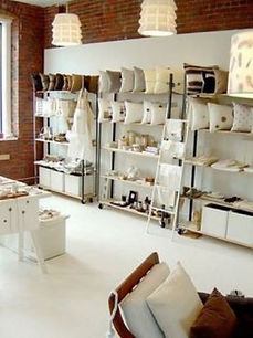

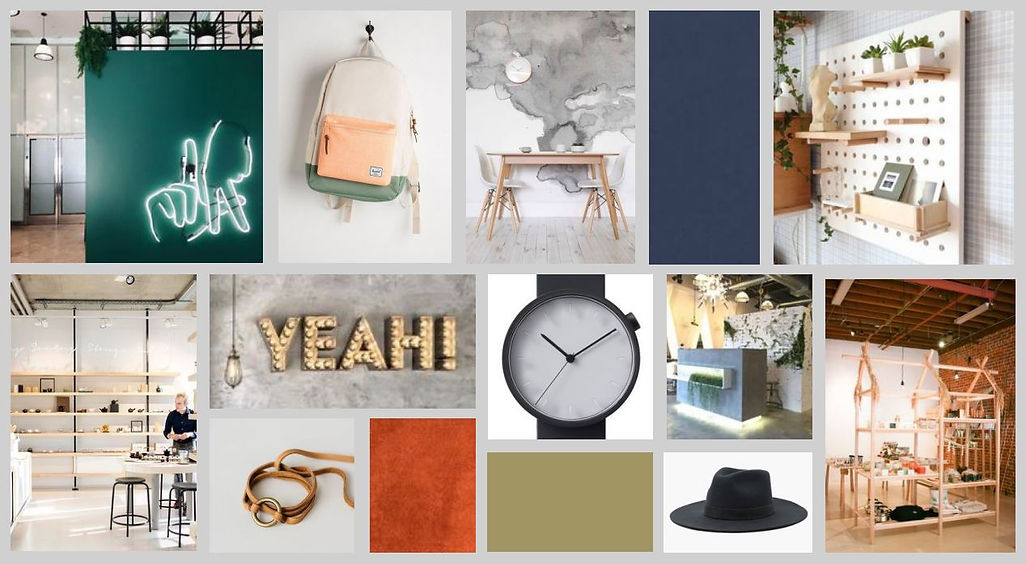
I started my research with taking a look at brands like Fossil and Michael Kors and I found myself disliking the consistency of extravagant displays. I found various smaller boutiques and accessory stores whose simple and sustainable product displays sparked inspiration for my design.


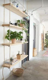
I spent a lot of time researching shelving design and I took a lot of interest in open, wooden forms, as well as boxy, geometric forms. All of my shelving, tables, and wall displays are all custom models made in Sketchup.
research
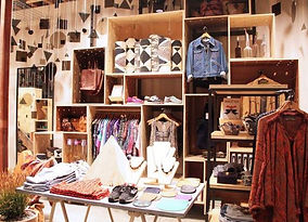

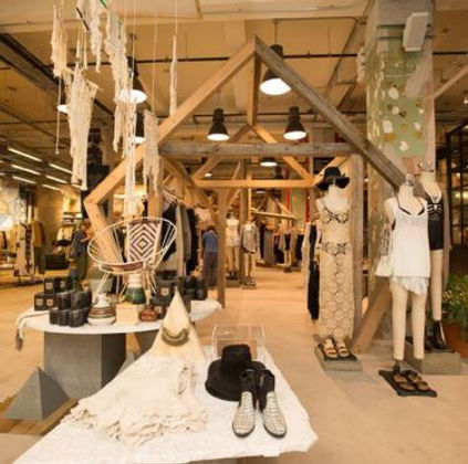
My inspiration stemmed from stores like Anthropologie and Urban Outfitters. I appreciate the sense of openness and a natural feel through the open, simplistic floor plan, followed with plain, boxy displays for products that are made from recycled wood finishes
low impact
sustainable
natural
minimalistic
neutral
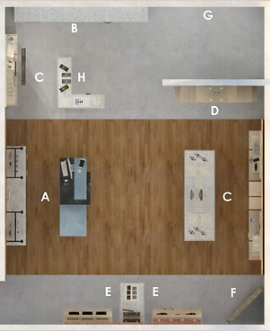
Rendered Floor Plan
Accessibility & Circulation
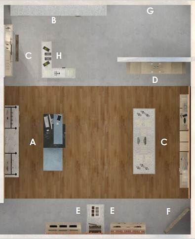
A - Cash wrap
B - Front display (visible from outside store)
C - Watches & Jewelry
D - Gifts, Novelties, Accessories
E - Handbags, Totes, Purses
F - Mirror
G - Entrance
H - Seasonal/new arrivals

Circulation path
5' Turning radius
36" x 48" Clearance
This plain achieved an open-concept, allowing for enough spaces for several customers to circulate without it getting to congested. This plan was made entirely in Sketchup. All displays seen in the plan were made made by me, building 3D components within the program. The wood accent flooring and wooden displays allow for a natural, sustainable feel.
A display greets guests right when they enter the store, perfect for sale or new items to pull people in. The idea with the front entrance is to pull guests in without giving all of it away. This way it leaves enough mystery to bring customers in and learn about the brand.
Beginning at he entrance of the store, the circulation plan allows customers to either enter the main, straight-shot of the store, or continue on to the seasonal items and new arrivals. The open space also includes several spots for a 5’ wheelchair turning radius and clear 3’ wheelchair width between shelving and tables. Going along with Two Street's mission to be inclusive, we recognize the ADA community and want them to feel respected and welcome within the stores.
The simple circulation plan reflects the minimalistic concept and product line. All displays limit a lot of material, creating an open feel throughout the space. Simple repetition of squares consist of the majority of the shelving.
Front Entrance & Cash Wrap Elevation

The large glass windows in the front of the store, filled with a large box display, can be seen from outside and customers are able to see some views of inside, not giving it all away. It can show off brand favorites, being the first thing customers see before entering the store. Neon signage is found throughout, shown in logos and inspirational quotes.
These elevations start to show some of the finishes and materials, including the concrete walls, wood ceiling accent, and industrial light pendants.


3D Perspective Views
The walls are complimented by a combination of white brick and the wood accent wall that stretches across the width of the store. Products are restocked frequently, allowing for the displays to maintain a minimal look.

The cash wrap area even took advantage of some space for displaying items. The counter itself offers an ADA compliant height, going along with the proper clearances around the store.
Process
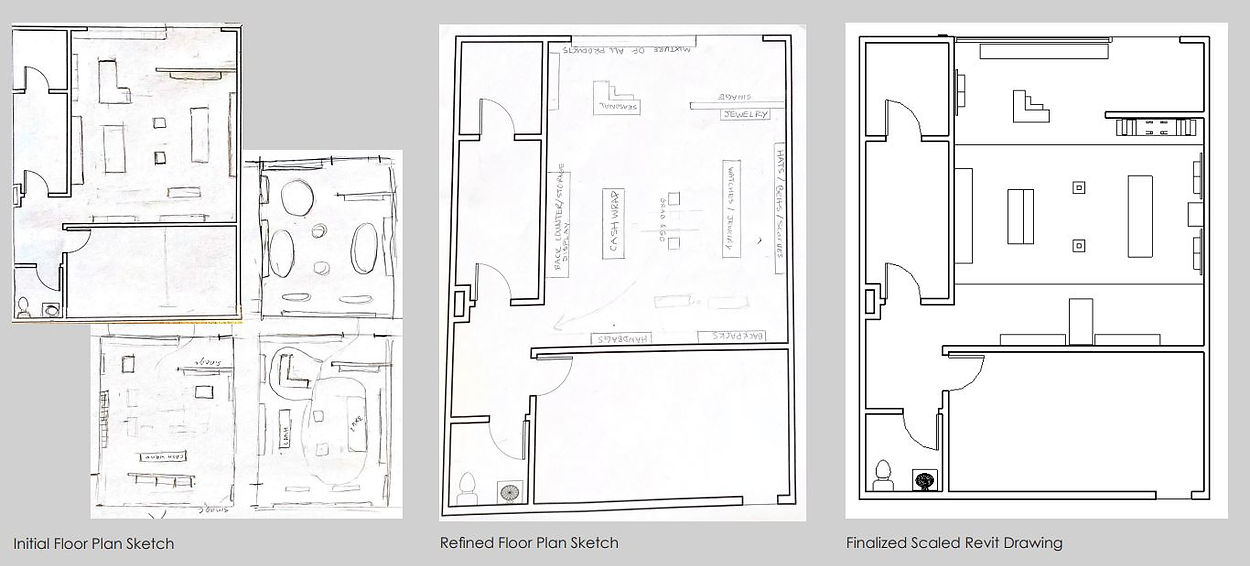
Since this floor plan was very simple, I had a lot of creative freedom for my layout. Although, it was tough to work with the size, as I couldn't make the displays too big or plentiful, avoiding small clearances.. My overall layout stayed the same, eliminating a few shelving pieces towards the end to allow for better flow. I wanted to take advantage of as much wall space as possible, and the large shelving unit in the front window really helped that.
Next up in Commercial design,